Do Popups Work for Increasing List Sign-ups? (and an OptinMonster Review)
No matter how much people might say they hate pop-ups, they work when it comes to increasing subscribers to your newsletter. Period.
Back in 2011, I began testing the use of pop-ups on various sites I owned. Everyone I knew claimed they found them annoying, but I kept hearing they had a huge effect on conversion rates. So I bought a plugin called PopUp Domination (I no longer recommend this plugin) and began running some tests.
The results were surprising to me. On the initial test site, after only two weeks the pop-up CTA accounted for 21% of total newsletter subscribers. Over the next few years, I continued implementing pop-ups on various sites in a variety of niches and continued to see similar results.
Then the plugin I'd been using was sold to a new owner. I wasn't happy with the plugin quality or customer support after the sale, so I uninstalled it until I could find a replacement for it.
Enter OptinMonster
When I mentioned I was on the lookout for a new pop-up plugin, OptinMonster [affiliate link] was suggested by a few people. It's a pretty impressive plugin. It works with tons of different CMS systems (including WordPress) and e-commerce software and has compatibility with 19 mailing list providers (including Aweber [affiliate link] – which is my mailing list provider). OptinMonster also offers technology for “after post” floating bar CTAs, but for the purpose of this post, I'll be focusing on the Lightbox (pop-up) technology.
It also features something they call “Exit-Intent Technology.” They claim to use this technology to identify when a user is about to leave your site and trigger a pop-up (which they claim converts an additional 2-4% of subscribers). I didn't experience those results using EIT but your experience may vary.
Another cool feature is their mobile-friendly technology. You can create specific pop-ups that show only to mobile users (such as a CTA to download your app).
One of the things I like best about the service is the ability to customize what type of behavior triggers a pop-up. For instance, you could choose to show a CTA only after a visitor has visited at least two pages and has scrolled down 30%.
OptinMonster plans [affiliate link] range from $49 per year (for one site) to $200 per year (for unlimited sites). Their “Exit-Intent Technology” and their mobile-specific pop-ups are only available in their Pro plan, which costs $200 per year.
The latest results for a blog I own
The use of pop-ups showed an impressive effect on newsletter subscriptions back in 2011. But how do they work now? Recently I added OptinMonster to a website that I own. The website got decent traffic but had a pretty poor conversion rate when it came to newsletter subscriptions. Prior to installing OptinMonster the site had a single newsletter CTA, which resided in the upper half of a right sidebar.
No effort went into the design of the pop-up aside from matching the color scheme of this site to their “Simple” theme pop-up. I have the pop-up set to load after a 5-second day once the person scrolled down at least 20%. The pop-up headline CTA used was pretty generic – “Sign up, so you don't miss a single update!”
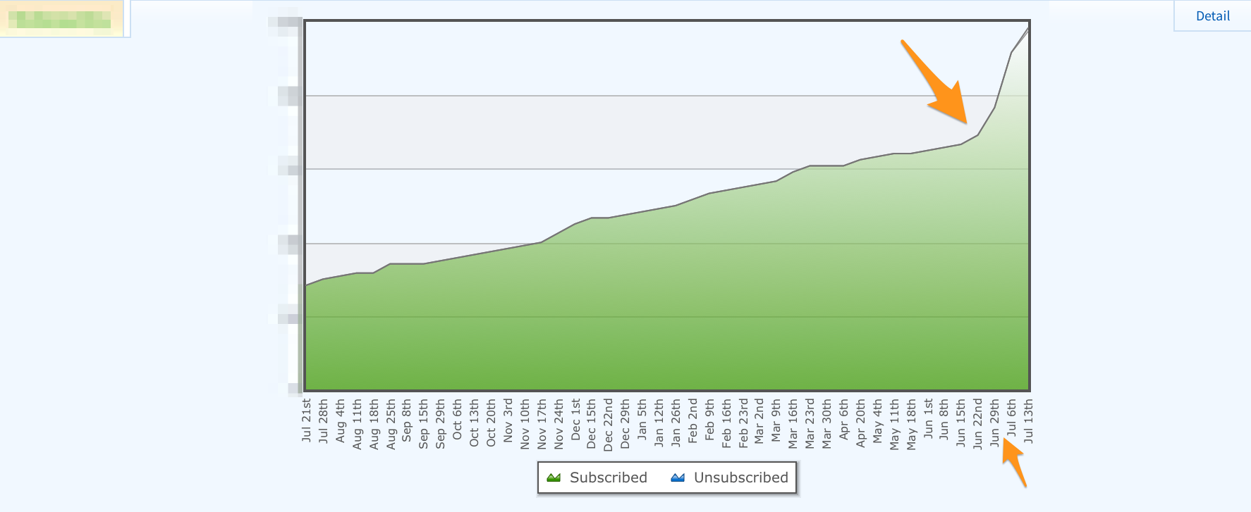
The below graph shows the subscriber growth statistics for that site's newsletter over the last 52 weeks. On July 3rd, I installed and launched an OptinMonster pop-up.
The conversion rate of the sidebar form has averaged .03% since the site launched. The OptinMonster pop-up has been converting at a rate of .47%. That is a 1400+% improvement in the subscription conversion rate.
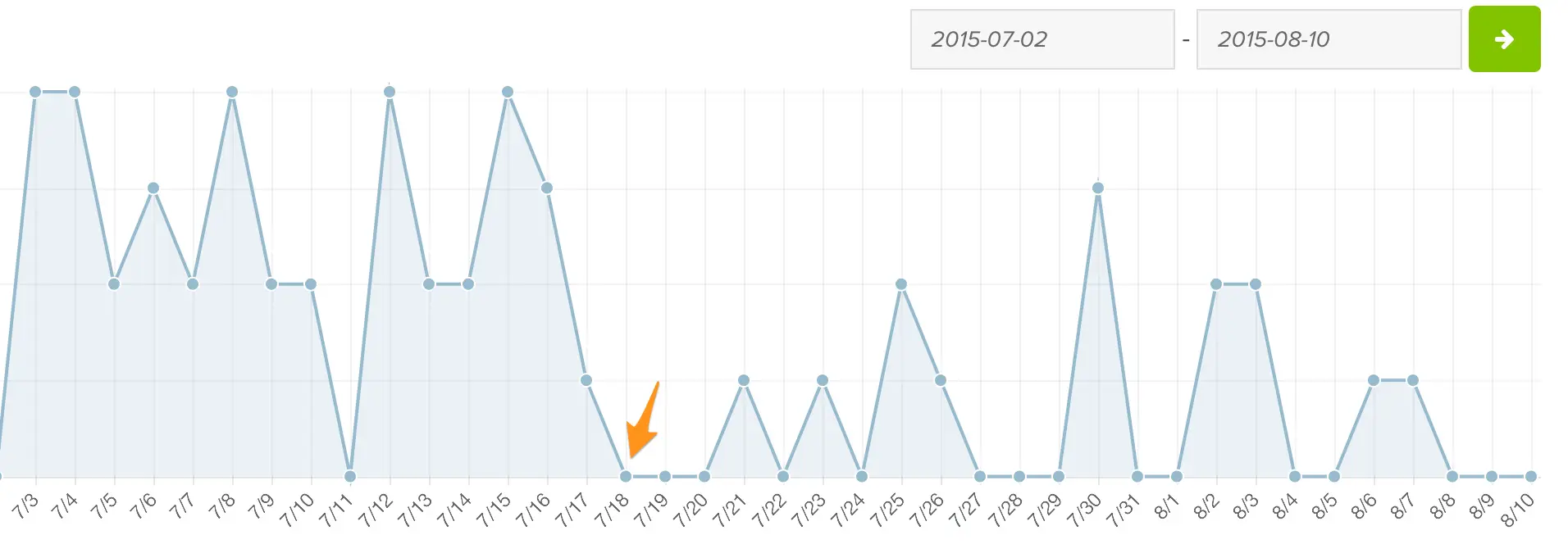
So what happened when I added OptinMonster's “Exit-Intent Technology” at a sensitivity setting of “20” to the pop-up on July 18th?
This ladies and gents, was a shocker – at least to me. Adding the “Exit-Intent Technology” reduced my signups and conversion rates for the list (at least compared to the initial pop-up results above). Below is a screenshot of the Optin Monster analytics report for the pop-up both before and after adding Exit-Intent Technology:
Now, don't get me wrong. The conversion rate while using the pop-up with the Exit-Intent Technology at .22% was still much higher than the .03% conversion rate without using the pop-up at all. But, I was a little dumbfounded as to how having an extra CTA could be causing fewer conversions.
As it turns out, “Exit-Intent Technology” (EIT) overrides all other settings.
After submitting a ticket to the OptinMonster support team, I learned that adding EIT use to a pop-up trumps any other settings you might have set. I figured it was an additional pop-up to the one generated by the current settings, but using it disabled the other settings.
So, using EIT means that the pop-up will ONLY show as the user is attempting to exit the page vs. the original settings I'd set. The control panel says, “Ignores loading delay and scroll trigger settings” under the EIT heading. However, I had assumed that the pop-up would still show based on my delay settings. I thought it would simply also now show (via EIT) if the person tried to exit prior to reaching those delay specifications. I was wrong.
I asked if it were possible to run a time/scroll delay and EIT concurrently. OptinMonster support advised:
“Your best case is to duplicate the opt-in and have one be your exit-intent and the other the time/scroll delay.”
However, that would mean one pop-up for drive-by visitors and two pop-ups for people who were spending time on my site. I felt like obnoxiously asking the latter segment for their email address would probably be a bad idea. So I decided to test it.
I duplicated the pop-up using their “duplicate” feature on the dashboard. I checked off EIT and began running the EIT pop-up in addition to the delayed one.
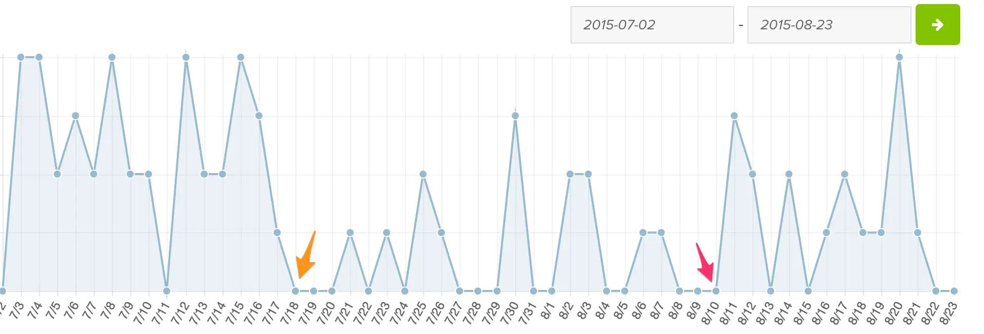
After two weeks of use, the additional, duplicate pop-up had a conversion rate of .16%, which was still better than the initial .03% conversion rate. The main pop-up converted at a rate of .32% over the two weeks that the additional pop-up was also running compared to the conversion rate of .47% it was obtaining prior. So, on this site, it would appear that the additional pop-up didn't help in the aggregated conversion rate.
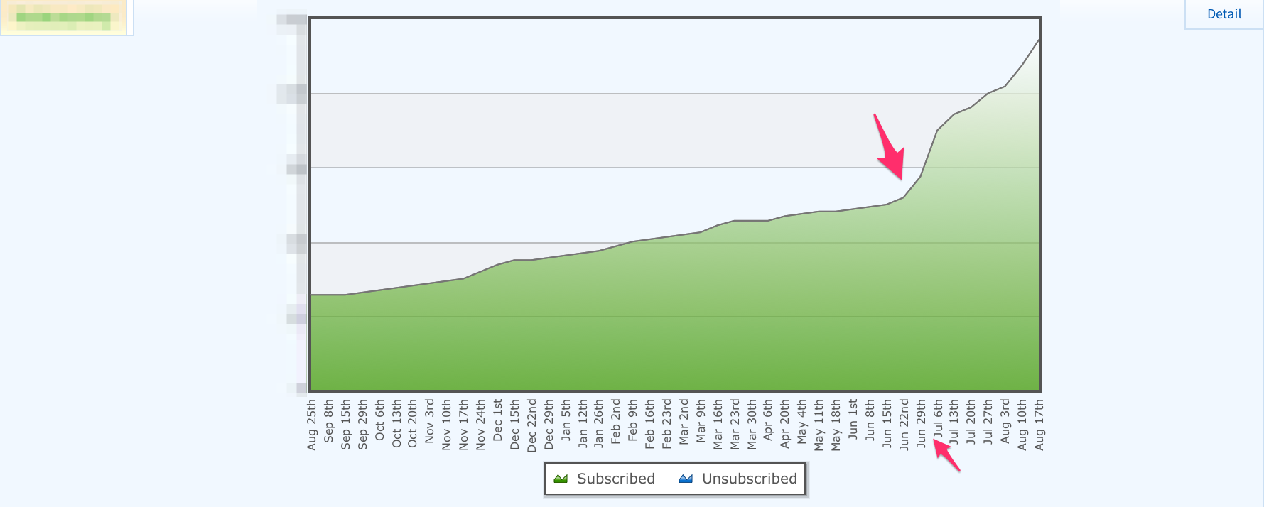
In the graphic of the stats for the main pop-up below, the orange arrow represents where I turned on EIT for the original pop-up. The pink arrow represents where I turned it off (and had the additional pop-up running). It would appear, at least in this specific instance, that the additional EIT pop-up was cannibalizing signups from the standard one. However, this is one experiment. I recommend you test it on your site and let the resulting data reach your conclusion.
So, I simply turned off the additional EIT and went back to the using the single, delayed pop-up without EIT.
Did the pop-up use affect the site bounce rate?
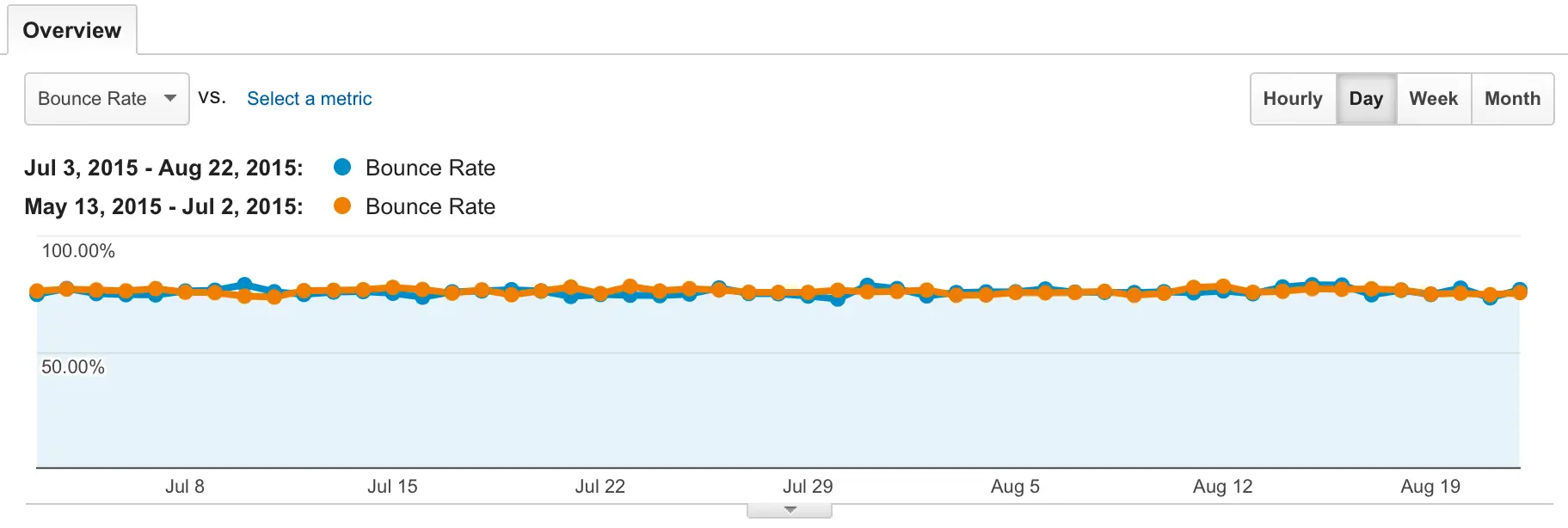
A common question that comes up when discussing pop-up usage is their effect (if any) on bounce rates. I compared the bounce rate for this site from July 3rd through August 23rd (the period the pop-up was in use) to the period prior. The bounce rate had decreased .46% during the period the pop-up was in use. That's a negligible change, so in reality, the bounce rate in this instance appears to have been unaffected by the pop-up use.
The TLDR results
Despite all the experimenting and trial and error, the final overall, averaged stats resulted in:
Pre pop-up use conversion rate: .03%
Post pop-up use conversion rate: .35%
Below is an updated graph of the site's subscriber growth (I began testing the pop-ups on July 3rd):
The pop-up usage, overall, generated more than 10x the amount of newsletter signups the site received without one.
The results of using OptinMonster on Sugarrae.com
Admittedly, I achieved the results above on a site with a very poor subscription conversion rate pre-pop-up. Since I know pop-ups work, I also took the time to add the pop-up CTA back to this blog (Sugarrae) as well.
In February of 2015, I launched a brand new design. Prior to that change, my newsletter subscription CTA in the top of the right sidebar rate was .30%. When I set out to redesign the Sugarrae site, increasing the number of mailing list subscribers was one of the priorities that drove the new layout. So I added the very large CTA in the site header that appears on every page of the site.
The conversion rate of the header CTA rose to 1.0% after launching the new design. That is a 230+% improvement from the subscription conversion rate prior to launching the redesign.
So, for this test with OptinMonster, the baseline conversion rate results would be compared to was a much healthier pre-pop-up conversion rate of 1%.
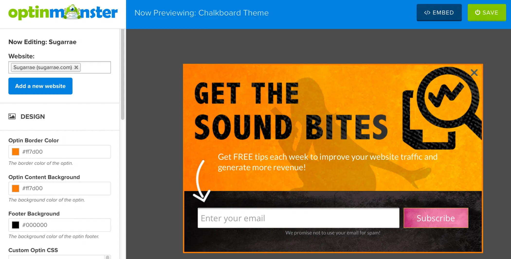
For this test, I modified the “Chalkboard” theme template to custom match the Sugarrae design.
The settings for the pop-up had it set to load after the user had been on the site for 5 seconds and scrolled 15%. I did not use an EIT pop-up on Sugarrae after seeing the results it had on my other site. After ten days of use, the pop-up was boasting a conversion rate of 1.37%.
As best I can tell, the pop-up use (with these settings, on this site) are not cannibalizing signups from the existing CTAs (which continue to maintain a 1% conversion rate). The pop-up appears to be generating additional signups.
The bound rate for the period of pop-up use when compared to the period prior once again decreased. This time by 1.3%, which again is negligible, so the pop-up usage appears to have had no real effect on the bounce rate for the site.
Do pop-ups work?
My latest results concur with my original results. pop-ups work when it comes to building your email list. Depending on your existing conversion rate, pop-ups can stand to increase (dramatically) your subscriber base (as it did with one of mine). If building your mailing list is a priority for you – and it should be – you should be using pop-ups.
I really like the OptinMonster [affiliate link] plugin, though I'm not sold on their EIT technology just yet. I'll have to run some more tests on additional sites. But, overall, the plugin is well worth the cost.
Honing with split testing
While the pop-up obviously works, I still have some work to do. I'm a big fan of split testing and the OptinMonster Pro plan [affiliate link] allows you to split test your pop-ups. This way you can test:
- CTA headlines
- CTA text
- Changes in button text
- Waiting 10 seconds
- Waiting 20 seconds
- Requiring no scroll
- Requiring a 50% scroll
- Color changes
- Etc.
If you can name it (and put a realistic hypothesis behind it), you should test it. I prefer to test something for at least two weeks when possible (unless the results drastically show negative results indicating that I should end the test early).
Have any pop-up tips to share?
If you use pop-ups and have any tips to share, feel free to do so in the comments below.
15 Comments
Please note – I use affiliate links on this site. This means I might earn a commission if you click on a link and sign up for something.
Last month I recommended this technology to one of my ecommerce clients, for implementation on their Magento store. Increasing their list is a huge priority for them, and I look forward to being able to play with the various options and A/B testing.
One of the the things that I’m particularly excited about is having separate pop-ups for different parts of the site – for example, we have a BOGO sale twice a year on certain products, so we can tailor a message to show for anyone in those categories to the effect that newsletter subscribers get first crack at the yearly BOGOs. Looking forward to getting creative with it.
“separate pop-ups for different parts of the site”
Yeah, OptinMonster has that feature and I’m definitely looking forward to playing with it further. :)
Rae,
1) What are your thoughts on employing popups on a site doing really well in Google organic search results?
2) You use Aweber. Have you experimented with their popups?
THANK YOU! A timely Post and VERY helpful!
From what I can tell, bounce rate seems unaffected and that would really be my only concern from that perspective. Additionally, I saw no issue with any of the sites I’m using them on and almost all rank well.
Re aweber, no, I’ve never used their popups.
Hey Rae,
Syed here, I’m the co-founder of OptinMonster and have enjoyed several of your talks at Affiliate Summit.
Thanks for sharing your review of OptinMonster, and I’m glad that you like the product.
-Cheers
Thanks Syed – I’m glad I found it!
Optinmonster is working out of the box and working like a charm.
Popup Domination gave problems on my website. Even after several promises made by chat and mail, nothing was done to fix the problems. So I strongly discourage to use Popup Domination.
I used to use popup domination myself it was good a few years ago but it does not seem to be keeping up to par with what Optin Monster now provides.
I currently have this on my blog with great effect but I am curious about adding it to some of my core websites as well. This post most likely will get my butt into gear this weekend and do just that!
I notice that you seem to be now publishing a lot of information via email instead of via your blog. Is this deliberate? Are conversions better when pushing info out via newsletters, instead of encouraging people to return here?
Hey Glenn! Thanks for reading all these years. :)
So, the evolution of Sound Bites was both purposeful and accidental.
It was purposeful in that when I did the last redesign, I decided it was time to finally start actually sending emails to all the subscribers I had been gathering. Prior to the first Sound Bites, I rarely sent the list emails. In addition to deciding the send the newsletter, I’d decided on the current format purposely as well. There were often times I’d seen articles I had short opinions on, or had tips that were short in nature. These were things that didn’t make sense to give their own post, but that were still valuable in nature. The Sound Bites format seemed like a great way to share them.
It was accidental in that, somewhere along the way, I started writing longer “bites.” Many of which could probably stand as their own posts. In the New Year, I plan to switch that up a bit and make those that can stand as their own posts into them and then reference them from Sound Bites. This will take more planning that I currently put in. I typically write Sound Bites on Friday or Saturday right before I send them out. In order to implement the above, it means I’ll need to plan Sound Bites at least a week in advance to push the posts out before Sound Bites goes out on the weekend.
I’ve also struggled with the composition of my readership. Two kinds of readers / subscribers make up the bulk of my community. Those who are advanced with affiliate and SEO (like you) and those who are complete beginners. It’s been a tough road in making one newsletter to serve both of those audiences. There is definitely a lot of trial and error surrounding my list. I’ve had a lot of sites over the years, but oddly enough, Sugarrae has never been a “flagship” site for me (as evidenced by the amount I post). It’s been a flagship promotional vehicle for my brand, but that’s different than being a flagship site from an income standpoint. In 2016, that will change a bit. :)
Great article Rae! Good kick in the pants! I’ve been meaning to do this on a number of sites including the blog everyone knows about.
One thing that I would like popup newsletter signup forms is to NOT be displayed if…
The visitor came to your site from a link in a newsletter.
It’s not super annoying, but slightly confusing, when I click on a link in a newsletter and am taken to a page that has a popup asking me if I want to sign up for the newsletter…
Great suggestion. I just sent in a support request to OptinMonster to see if it’s possible to exclude the popup from showing if ?utm_source=sound-bites appears in the link. Will let you know their response!
So, it turns out this is possible. I’ve copied their support response below. So, looks like I have another parameter to add to my newsletter links.
Yes, you can do that by adding &omhide=true at the end of your UTM parameter link.
Example: https://sugarrae.com/online-marketing/seo/wordpress-site-from-http-to-https/?omhide=true&utm_source=sound-bites&utm_medium=email&utm_campaign=issue-44
or https://sugarrae.com/online-marketing/seo/wordpress-site-from-http-to-https/?utm_source=sound-bites&utm_medium=email&utm_campaign=issue-44&omhide=true
The placement of omhide=true doesn’t matter. As long as it’s there, it won’t show.
Here’s the link to a documentation that shows that as well:
http://optinmonster.com/docs/how-to-hide-optinmonster-from-existing-newsletter-subscribers/
Now, they mention that it doesn’t matter where you place the omhide code – but I’ll have to test whether the order matters from GA’s perspective. I’ll probably tack it onto the end of Sugarrae links and that should be alright from a GA perspective, but I’ll test on another site if adding it in other locations changes how GA handles it.
Great test on pop ups :) In fact, they were what prompted me to join your list earlier today! As a side note, I’ve looked into optin monster and other plugins, but I really think “ThriveLeads” is hands down the most comprehensive, kickass plugin of them all. It’s got built in a/b split testing options, options to switch it on/off for desktop or mobile, great premade themes and easy integration. I’m clearly not an affiliate or anything but as a marketer I would definitely check it out.
Great site :)