One Change Increased My List Opt-In Conversion Rate By 56.35%
I see advice on a constant basis about how to increase your newsletter subscriptions. Most of the time, they are part of a generic list with claims about doubling or tripling conversion rates, yet I very rarely see them accompanied by actual analytical data confirming the recommendations. So a few months ago, I set out to begin testing these ideas.
The claim
Using a static bar (think “Hello Bar”) at the top of your website with a CTA for your newsletter sign up increases opt-in conversion rates.
I've seen this claim so many times now that it would be inaccurate to cite any single source as being the inspiration behind this test. There are also multiple services that provide different “styles” of static bars. You can choose to put your signup form directly in the box or to link to your newsletter subscription CTA page, etc. You can make it stand out or blend in. The options for a seemingly simple site feature are surprisingly numerous.
The background data for the test site
- This is an affiliate site I own that does about 250K page views per month (so we are not talking about a site with 500 visits a month).
- The site already features a “subscribe bribe” (stay tuned for an upcoming test on that) and has for a long time.
- There are two other newsletter subscription options built into the site navigation. One in the upper half of the sidebar (but below the fold on most browsers) and one in the footer. Both of these mention the subscribe bribe.
- This data is for confirmed opt-ins (vs. people who sign up but never click the confirmation email) – meaning they fully completed the double opt-in process.
- I made no other front end changes to the site within the time frame of the data I'm sharing.
- This site (like all of my sites) uses Aweber (aff link) as its mailing list service.
- Typically I would A/B test the concept simultaneously using Simple Page Tester (aff link). However, in this particular case I simply made the change site-wide as I was pretty confident the effect would be positive. And since I own this site, I can make changes based on being “pretty confident” vs. statistically sure. Had I foreseen writing the results of this change up as a post, I would have used A/B testing.
The specifics of this test
- I used a plugin called the Peanut Butter Plugin (PBB). It was cheap ($15 as of the time of this post, though they do have a more limited free version) and already had Google Analytics event tracking integrated into it. There are (countless) other options to implement a static bar such as the Hello Bar which is subscription based (no thanks). You can also code that sucker in yourself. But PBB is what I used.
- The PBBs I used was coded to match the site colors.
- I used two separate PBBs during this test.
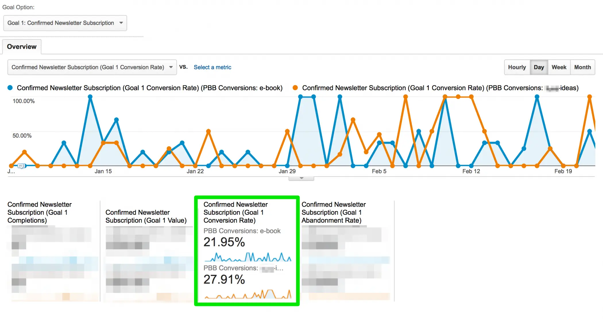
- One was a written CTA for the subscribe bribe that linked to the newsletter sign up page. This bar appeared sitewide except for in the “ideas” category of the site. We'll call this PBB E-book CTA.
- The second was a written CTA telling people they could expect more ideas on X by signing up for the newsletter (with no mention of the subscribe bribe) in the PBB. This PBB included a link to the newsletter sign up page (that page does mention the subscribe bribe though). This second PBB only appeared within the “ideas” category on the site, which is the most trafficked category. We'll call this PBB Ideas CTA
- I tracked both PBB bars used with separate Google event tracking codes so I could isolate the data for each in Google Analytics.
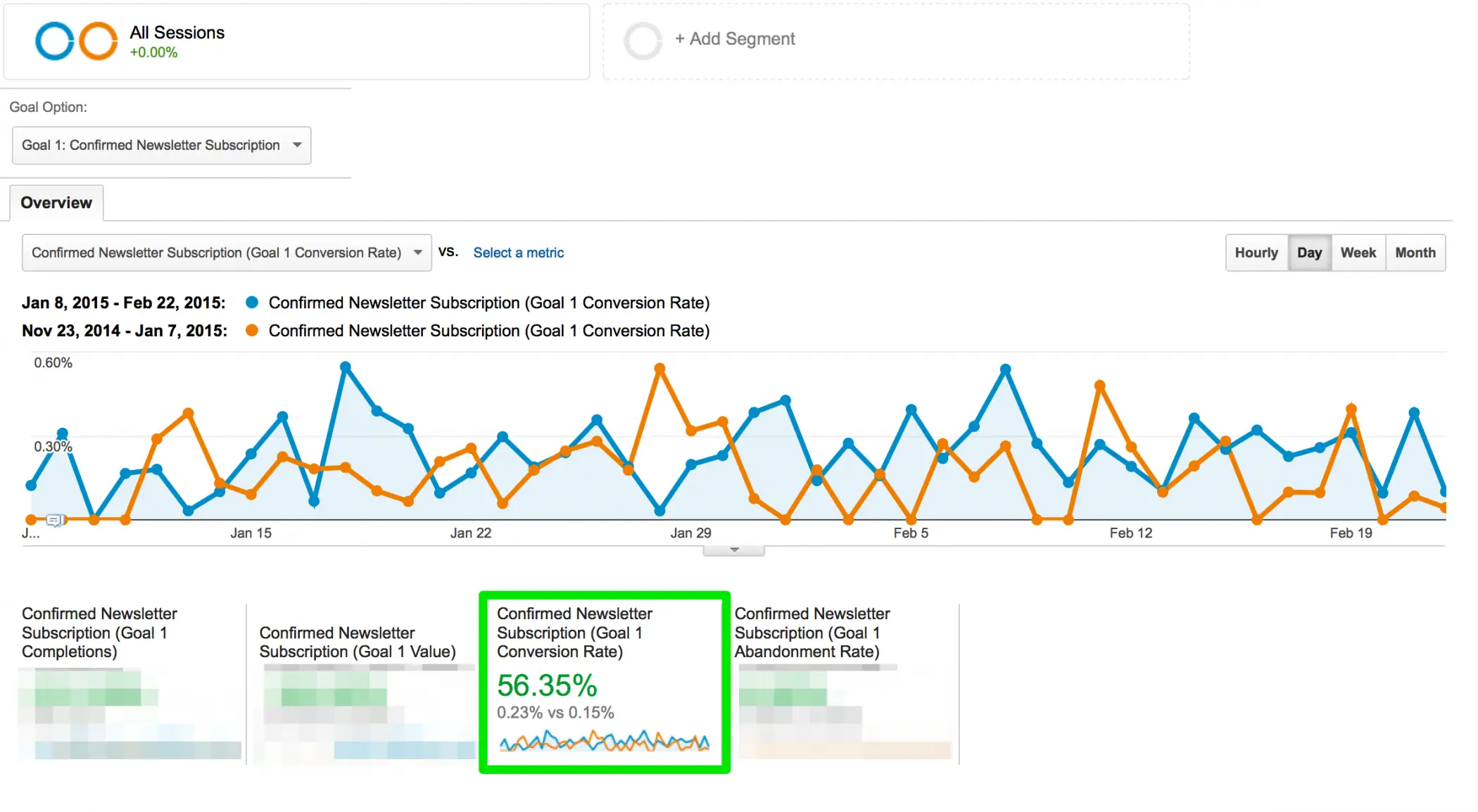
- The results listed below are based on a six-week window beginning on January 8, 2015 and running through February 22, 2015. It compares the data for this period with the data for the six week period prior (November 23, 2015 through January 7, 2015).
An important thing to note for beginners
In the results, we're segmenting the data by conversion rate. So, why aren't we simply using the increase or decrease of subscribers to determine the success or failure of a method? We can't do that (with any reliability) because lots of outside variables can affect the fluctuation of the overall number of subscribers. Traffic can fluctuate in regard to seasonality of the site, holidays, being featured on a large site, etc. To truly measure the success or failure of a campaign like this, we need to look at the conversion rate. “Out of every 100 people who visit my site, what percentage of them sign up for the newsletter?” That number has a much higher likelihood of accurately interpreting the results of a test like this.
The results
This test resulted in an increase of 56.35% in the overall site double opt-in conversion rate.
When comparing the conversion rates of the PBB E-book CTA (21.95%) vs. the PBB Ideas CTA (27.91%), it appears that the PBB Ideas CTA won out. People seemed to respond more to the promise of future information that was similar to the specific information on the page they were on vs. the immediate gratification of the subscribe bribe.
So what now?
Now that I know the bar has a positive – and significant – impact on opt-in conversion rate, in general, it's time to start running much more granular tests.
- What happens if I make the bar stand out vs. blend in with the design?
- What if I use bright red?
- What if I use bright orange?
- What if I add the ability to subscribe (AKA the subscribe form) into the bar directly?
- What happens when I add both a name and email request?
- What happens if I only ask for their email address?
- What happens when I try different fonts?
- What happens if I try different font colors?
- What happens if I use the word “free?”
- What happens if I swap the word “great” for the word “amazing?”
- What if I make the bar taller?
You get the idea. Once you start going granular with the changes, you'll want to run these as A/B tests as it will be faster at obtaining statistically reliable results. As I mentioned above, I use Simple Page Tester to run split tests (aff link).
Future tests
I've got several more tests planned, but if you have something specific you'd like to see me test out, please let me know in the comments below.
11 Comments
Please note – I use affiliate links on this site. This means I might earn a commission if you click on a link and sign up for something.
I, as many other webmasters I am sure, am guilty of ‘taking another blogger’s word for it’ simply because I don’t have the time/desire/knowledge to run tests myself.
However, it’s very refreshing to know WHY something works (or not) – so keep’em coming, Rae.
Oh, I definitely have before too haha. :) I was looking for list opt-in conversion tips and was somewhat overwhelmed and decided “well, can always test them one by one to see which ones are bullshit.” :)
Thanks for sharing Rae! I’m now givin it a spin.
No worries – would love to see how your go turns out! :)
Hi Rae,
Interesting post. I’ve just recently put a bar across the top of my blog but I haven’t noticed a difference yet but then again, I don’t have the following that you do, “yet.” LOL
Thank you for sharing your results.
Heh, this was actually on a different site, but, yes, it does have quite a bit of traffic for its niche. I think it’s harder to test these things on a smaller or lower traffic site. I tried the subscription sign up tick box you see on Sugarrae on that site and it flopped huge, but despite all the traffic, this particular site I tested above doesn’t attract many comments. That said, I’m currently seeing what effect it has on Sugarrae. ;-)
Great post. Thanks for sharing details and numbers.
I have read about insane opt-in conversion rates using a content locker in a post/on a page. Can you add “What happens if I use a content locker to secure some premium content within a page” and let us know when you have had a chance to test it out.
PS: Love the new layout here.
Thanks Lyndon! I actually have used a content locker in the past and saw good results, BUT, I didn’t get super granular about what ELSE it might have affected. Just if it was used, so I’ll add this to the list for testing. :)
As you suggested on twitter, here a few more ideas if your todo list still allow it :)
– Switch the hello bar with a lightbox
– Use category specific offers & cta’s . For example for this category (analytics) you could go with “download my analytics book/tips/whatever” and in the seo category “download my seo book/tips/whatever”. Personally seeing better results with that kind approach.
Looking forwards to the upcoming tests ;)
PS: btw the ‘sign up to get the newsletter’ checkbox is not working for me.. or shows no visable checkmark when clicking
Thanks Dave! Interesting on the newsletter chec kbox. I see a check mark when I click it. I’ll hit you up on Twitter to find out what OS / browser combo you’re on. :)
Great post. I’m going to have to try to run this test myself. I’m currently doing some maybe testing with four different types of widgets, sliders, sticky footer/header etc.